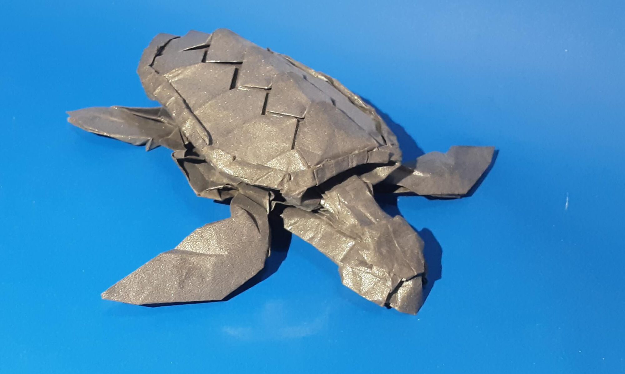
Wether I look at a new crease pattern or an old one, one designed by myself or by another artist, I always wonder: What can I learn from it and is it a “good” crease pattern?
Every crease pattern that leads you to the desired model is a “good” one. However I have found some similarities between those crease patterns, which I liked best.
They are efficient, allow details (in the crease pattern or after folding the base) and are only as complex as necessary (still quite complex in some cases;)). I figured that these are important factors for a (good) crease pattern and therefore I try to keep them in mind.
Efficiency
What is efficiency and how can you measure it?
The less paper is used for each feature and detail of a model and the less paper is used for the model (regardless of the actual paper size), the more efficient is a model.
You can measure the efficiency using the ratio. However, there are several problems:
First of all you can´t compare the ratio of different subjects (e.g. a Crab and a Bird) very well.
Additionally, the amount of detail influences the efficiency, for example, a scaled fish usually needs more paper than a fish without scales. Is the scaled Fish less efficient? Depends on the efficiency of the scales (at least I think so). Therefore I would look at the ratio as well as the amount of paper that actively helps the structure to determine the efficiency of a model. In the most cases, efficient models feature a beautiful (possibly complex) structure.
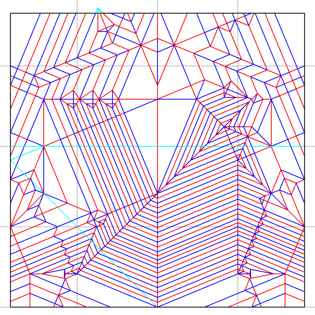
The crease pattern of my iguana. The ratio of 0.57 might not seem really efficient. While the ratio of Chris Heynen´s or Brian Chan´s lizard is surely better, they don´t have spikes on the back and tail. That´s why I believe this is one of the most efficient solutions for an iguana with spikes.
Why is efficiency an important factor for a (good) crease pattern?
An efficient model most often has a beautiful structure. Another important (and useful) aspect of efficiency is that efficient models often are easier to shape.
Why? – Less layers in each appendage means less paper to bend and bring into the desired position. You can also make thinner appendages.
So, efficiency must never be the main aim, it shall only support the beauty of the final model.
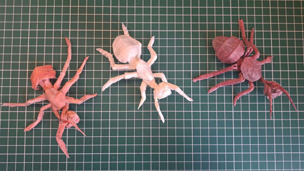
The development of my Ant.
Version 1 (left) and Version 3 (right) use a 32×32 grid. Version 2 features a 34×34 grid. The difference in efficiency doesn’t seem like much, but it explains, why only version 2 has legs I couldn’t shape well. I used the same paper and the same size for all three.
Notes:
There is now easy way to reach efficiency.
The general layout is often the decisive factor for that. The most difficult part is balancing efficiency, the space for details and complexity (more on that later).
While focusing on efficiency, keep the general layout as simple as possible, that helps when adding detail.
Do not be afraid of odd grid numbers or odd grids (see my griffon).
Bigger grids often come with better efficiency.
Assymetry can help increasing efficiency.
It helps to look up circle packing and the ERM, they can help you better than I can (I´m just here for filling in some gaps I noticed).
Last, but not least: Refining my crease patterns helped me a lot, it might help you, too.
Details
Details are quite obvious: You want details to make your models more lifelike. The biggest questions are:
- How many details do you want to include in the design?
- Is it better to include the details in the crease pattern or to fold them after collapsing the base?
These questions are for you to answer.
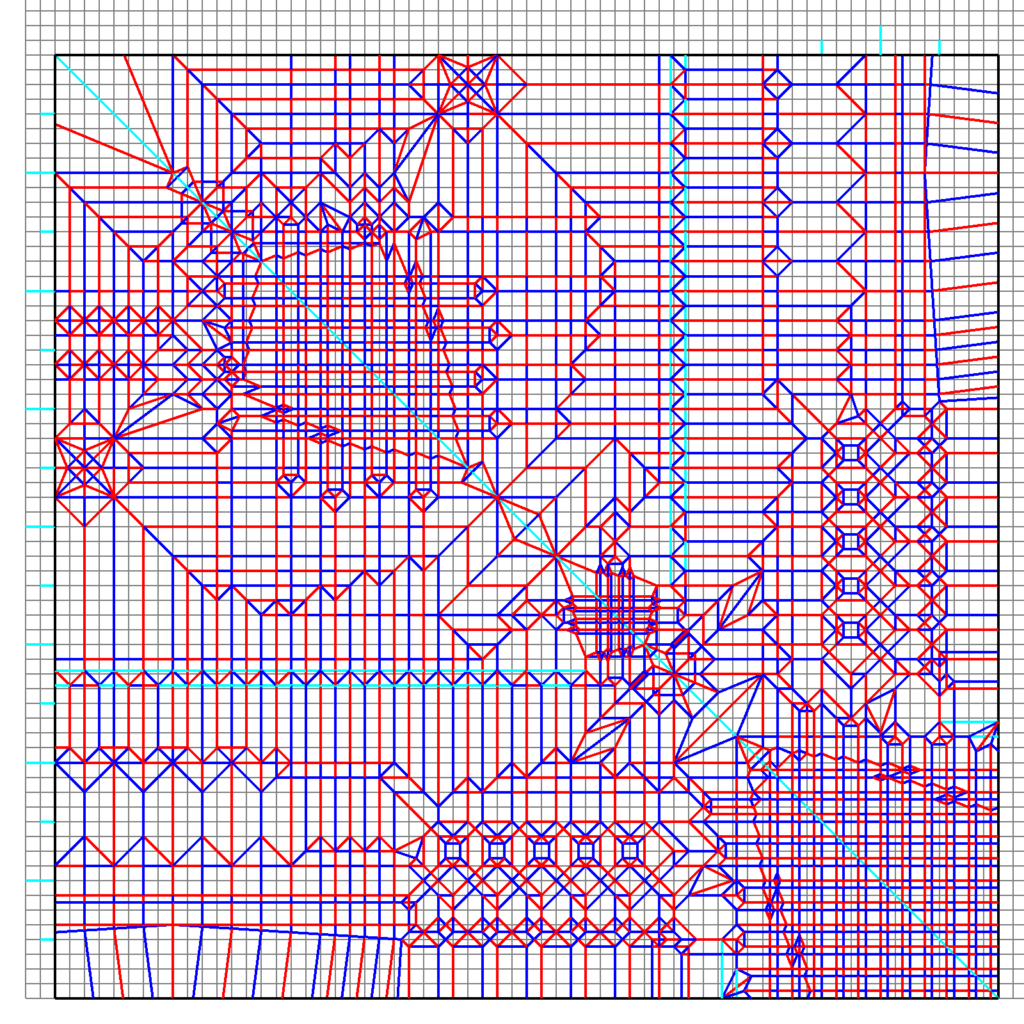
The crease pattern of my Eagle V1.
It features far more details than NGUYỄN Hùng Cường´s eagle and it is slightly more efficient. However it is far more complex (you can find the crease pattern for it via the link). In this case including the details in the crease pattern has increased the efficiency, the ratio is 0.56 for mine and 0.44 for Cường´s. Due to the fact that both crease patterns use a similar general layout, the ratio can be used to determine the efficiency.
Every model will be different, which is why I did not include the pattern of the wings in the crease pattern of my Butterfly V2.
Looking at different crease patterns and wondering wether more or less details included the crease patterns might be useful, will tell you your preferences.
Most crease patterns feature some amount of details, which is why I think they are an important factor. As with efficiency it´s not about the quantity of included details, but the quality they bring to the crease pattern.
More detailed crease patterns are more difficult to grasp, less detailed crease patterns have a bigger risk of not getting the model right.
Sometimes, you can solve these problems by including the details in a symmetric crease pattern only on one side.
Notes:
I like to include at least a part of the details in the crease pattern. Not the whole eye, but a flap that will become the eye.
Claws and the special feet of athropods are included in my crease patterns ( if i decide to make them).
I like details, but minimalistic design also has some nice approaches, I recommend trying out different styles and a different amount of details (This way, I found my preference).
Complexity
In theory, you want the model to be as simple as possible. Then the final model is more likely to be precise. But of course it can´t be just that simple. While you can try to keep many structures as easy as possible, some crease patterns can´t be simplified. All my experiences with designing and folding crease patterns let me assume a correlation between complexity and the previous factors.
Increasing the efficiency and the amount of details leads (usually) to a more compex crease pattern.
However a complex crease pattern needn´t always be efficient nor detailed.
The crease patterns of my Ant V2 and Ant V3.
They illustrate the phenomenon that I like to call the Efficiency-Complexity trade perfectly. The crease pattern of Version 2 is far less complex and features a 34×34 grid. The crease pattern of Version 3 only has a 32×32 grid. The difference is small, but it greatly affects the complexity, Version 3 is far more complex. However the increase in efficiency has drastically helped when shaping the model due to the fact, that there are less layers I needed to position.
I also made the head slightly smaller in Version 3.
I tend to make complex crease patterns, because I prefer efficiency and details. There are few designs, that are really efficient, detailed and simple. Every designer has to find a compromise between these factors for a good crease pattern for every model.
Several things can make a model more complex:
- Many appendages (the more complex the abstraction, the more complex the crease pattern) .
- A large grid (the smallest used division is the grid).
A model using 96ths is often more complex than a model using 48ths. - Off-grid structures like Pythagorean stretches.
They increase the efficiency, but also the complexity. However I recommend using them. Often, the crease pattern becomes more elegant, too.
These factors can indicate, if a model is more complex, but most often you can see that clearly in the crease pattern (complex cps have are weird stuff)
Notes:
As long as you can fold them, I wouldn´t bother too much with complexity.
You can reduce the complexity using level shifters. Only parts of the crease pattern are on a bigger grid, the rest will be more simple to fold.
The main question regarding complexity is “How far do you want to take it?”
Conclusion
In the end, every crease pattern that results in the desired model is a “good” one. But the factors efficiency, complexity and details might help you determining if you are satisfied with a crease pattern or if you still want to work on it.
Often an increase in efficiency or the amount of details will cause an increase in complexity.
