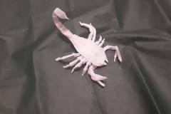
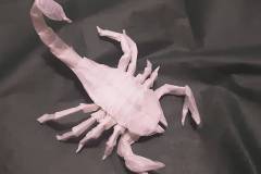
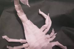
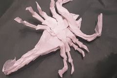
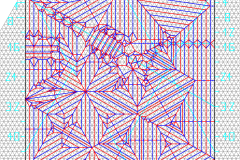
I wanted to make my scorpion as efficient as possible. Many origami scorpion designs use the middle of the paper to make the tail.
Because this takes a lot of paper, I located the tail in a corner. I placed the longest legs and the claws on the sides of the square, too. Additionally I used Hexpleating, which I deemed more efficient than Boxpleating.
This led to an asymmetrical general layout, that is quite unique. The top side is divided into 44 equal units to make the grid. I have included some auxiliary lines in the crease pattern. Personally, I use such a kind of auxiliary lines quite often, because they provide orientation.
It has a ratio similar to Robert Lang´s “Scorpion varileg”, however the legs of my design are longer, the body and tail are more detailed. It even has some details on the belly. At first I thought I had reached my aim, but when I put it next to Kota Imai´s scorpion folded from the same paper, found out that these designs are practically equally efficient. Additionally, Kota Imai´s scorpion has a detailed belly. Therefore I figured, that the system (Boxpleating, Hexpleating etc.) is not responsible for the design. I wrote a detailed explanation for that here.
The crease pattern is quite funny to fold and the model locks together nicely. The legs can be distributed symmetrically after folding the base. If you are looking for unusual designs, for asymmetric designs or for Hexpleating practice, I can recommend folding it. The technical aspects are dominant in the crease pattern and I have learned quite much from this design. It was the first time I used Off-grid structures in a Hexpleated design.
It is possible to incorparate a Pythagorean Stretch in Hexpleating.

