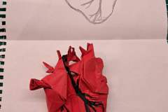
On my birthday, I received a gift that might seem strange to many. And might even have upset a few. The sketch of an anatomically correct heart. A response to the gag was in order. Would you expect me to see the sketch and not try design such a model?
A heart has a very distinctive structure. The ventrikels give the main part its shape, the left ventricle is more muscular than the right. Above these, there are the the right and the left atrium. Additionally there are veins like the vena cava and arteries like the Aorta. The shape of the heart and some veins had to be included to make the design recognisable.
While some veins entering and exiting the heart were necessary, I decided to stick to the sketch I was given and focus on the coronary artereies and veins. Because I wanted to give the design some character, I wanted a colour change for them.
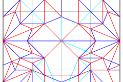
In order to create the colour changes and the veins, I started with a waterbomb base, the main body of the heart coming from the middle. One half of the paper was used to make the colour changes, the other one for the veins entering and exiting the heart.
The design is a 22.5° design, the references should be no problem 🙂
Usually my designs use Boxpleating. However in this case, using 22.5° structures proved to be far more elegant. They were the best way to combine the delicate colour changes with the big and round shapes of an anatomically correct heart.


